
From a Sticker on a Stock Box to Target and Amazon:
A Product Packaging & Brand Design Case Study for Allsaid & Dunn


AT A GLANCE
CLIENT: Allsaid & Dunn, LLC: Erika Bird and Kenneth Hodkinson | FOCUS: Brand, game, packaging, and marketing design for three educational and strategy game products, from prototype to retail | LOCATION: Remote from California's Central Coast (client based in Coronado, CA) | ENGAGEMENT: 2010-2017
Allsaid and Dunn: A product packaging and brand design case study
The Situation
Kenneth Hodkinson wrote the first book in the Wordly Wise series, a vocabulary program that grew to span kindergarten through 12th grade and became a classroom standard across the country. Later in his career, he turned to something more playful: a learn-to-read card game for young children that he called The Reading Game. His daughter, Erika Bird, took over its development, marketing, and distribution through their family company, Allsaid & Dunn.
They had a proven teaching method. What they didn't have was a product. When Erika first reached out to me through a referral from a networking group, The Reading Game existed as an idea, a word list, and a plan. The first prototype we built together was assembled with help from a local UPS Store: hand-trimmed books, a first deck of cards, and a box label printed as a sticker and applied to an existing box. It was built for one audience, the printer, so the game could move into real production.
From there, the job grew in every direction. Over the next seven years, Allsaid & Dunn needed a designer who could take each product from concept to market: the brand, the components, the box, the photography, and the marketing that would put it in front of parents, educators, homeschool networks, and distributors. Then a second product, The Magic Stories. Then a third, Bin'Fa: The Tao of War, an adult strategy game Ken had been refining since the 1970s.
The Strategic Decision
Three products, three completely different audiences: kindergartners and their parents, second through fourth grade readers, and adult strategy gamers. The temptation with a family of products is to give them all the same look. I went the other direction. Each product got its own brand built for the person actually holding it, while the working method behind all three stayed the same.
That method came down to two decisions.
Design backward from production. Every box started with the printer's own template and specifications, not a blank artboard. Dielines, bleed, panel construction, and UPC placement were settled first, so the creative work lived inside what could actually be manufactured. Nothing came back from press as a surprise, and no design had to be compromised at the last minute to fit a box it was never built for.
Honor the handmade work instead of replacing it. Two of the three products arrived with original hand-drawn artwork: scanned illustrations for The Magic Stories and a hand-drawn battle banner for Bin'Fa. Starting over would have been easier. Keeping that artwork, and doing the technical work to make it hold up in print and packaging, kept each product's original character intact. Those hand-drawn pieces are a big part of what made each product feel like it came from a real author instead of a factory.
The third advantage was simply continuity. Because one designer carried every touchpoint for seven years, the card decks, the boxes, the manuals, the product photography, the flyers, the emails, and the trade show booth all spoke the same visual language.
SERVICES —
- Brand design
- Product packaging design
- Game and print design
- Commercial product photography
- Marketing collateral
- Trade show design
______
She was never about choosing
between warm and credible; it was about proving she could be both in the same afternoon, in three different settings.
______
500+
She was never about choosing between warm and credible; it was about proving she could be both in the same afternoon, in three different settings. That's the kind of range a single headshot can never show.
The Work
The Reading Game
Brand. I designed The Reading Game's logo and color scheme: bright, friendly, and easy to read at a glance for a product whose entire purpose is helping a five-year-old feel successful.
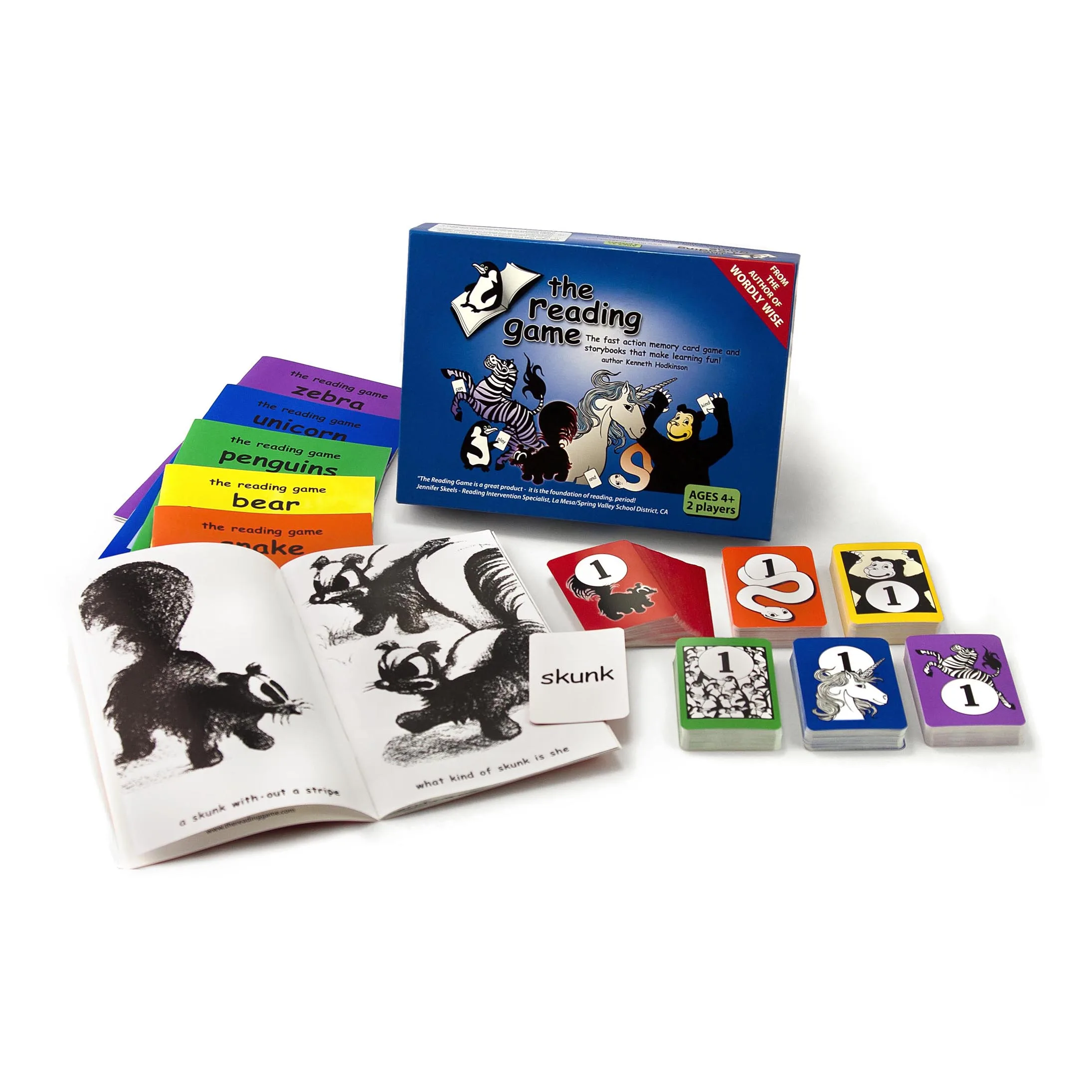
The game itself. I designed all six decks of word cards and the picture-based flash cards, and laid out all six storybooks and the Teacher and Parent's Guide. Each piece had to work as a teaching tool first: clean, uncluttered type a beginning reader could decode, with nothing on the page competing with the word.
The box. I designed the box top and bottom from the printer's template, working within their specifications for final artwork, including UPC placement. This is the piece that took the game from a sticker on a stock box to a finished retail product.


Product photography. Once the game was printed, I photographed the finished product in the studio on a high-key backdrop for retail listings, the website, and marketing. When the second edition added a new deck of animal and object flash cards, there was no need for a reshoot. I removed the original box from the photograph, replaced it with the second-edition box, and composited in the new flash card stack, so seamlessly that the final image reads as a single shot.

Marketing. One-sheet sales flyers, web and magazine ads, and Mailchimp email campaigns aimed at distributors, homeschool networks, and educational supply houses.
Trade show. For Allsaid & Dunn's trade show presence, I designed a 10-foot full-graphic pop-up backdrop, a 41-inch podium with a custom graphic wrap, and a companion marketing flyer for the booth. Erika used the display at show after show.


The Magic Stories
Brand. I designed the logo and color scheme for The Magic Stories, the follow-up program for second through fourth grade readers.
The books. The Magic Stories is a series of six illustrated storybooks, each around 20 pages, with accompanying worksheets and charts. The illustrations arrived as hand-drawn, scanned artwork. Every page needed cleanup before it could go anywhere near a final file: removing scan artifacts, correcting contrast, and preparing each drawing for clean black-and-white reproduction. Then I fully paginated each book, laid out each book's deck of Naughty Forty flashcards (the 40 hardest words in the story, each paired with the sentence it appears in), and designed the supporting worksheets and charts.
The program is sold as a downloadable, printed at home in black and white, which turned a production constraint into a feature: children can color in the illustrations as they read.
Selling a product you can't hold. A download has no box, so the marketing had to do the box's job. I created the main product graphics used to sell the program online: the six books shown printed and stapled, the worksheets laid out beside them, and the flash cards with a pair of scissors, ready to cut. In one image, a parent can see exactly what they're getting and what they'll do with it.
Bin'Fa: The Tao of War
Bin'Fa is the oldest idea in this story and the most complex design problem. Ken first conceived the game in the early 1970s, built on the strategic principles of Sun Tzu's The Art of War, and kept refining it for decades. The edition I worked on reimagined the board itself: the original single hexagon became six separate sections that players reconfigure into new terrain every game.
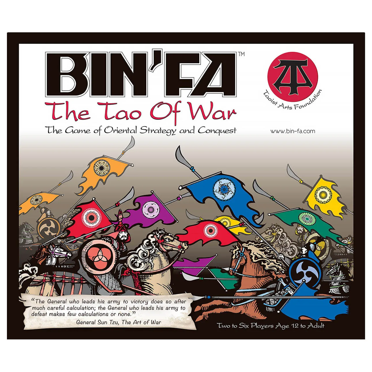
Logo and packaging. I refined the existing Bin'Fa logo and designed the box cover, back cover, and packaging. The centerpiece was a hand-drawn banner commissioned from an artist: two armies charging each other on horseback. I received it as high-resolution scans, and it was beautiful, but it was never built to fit a box. To make it work, I vectorized many of the individual elements so they could be separated, layered, and overlapped to fit the construction of the box and the marketing pieces that followed, without losing the hand-drawn energy of the original.
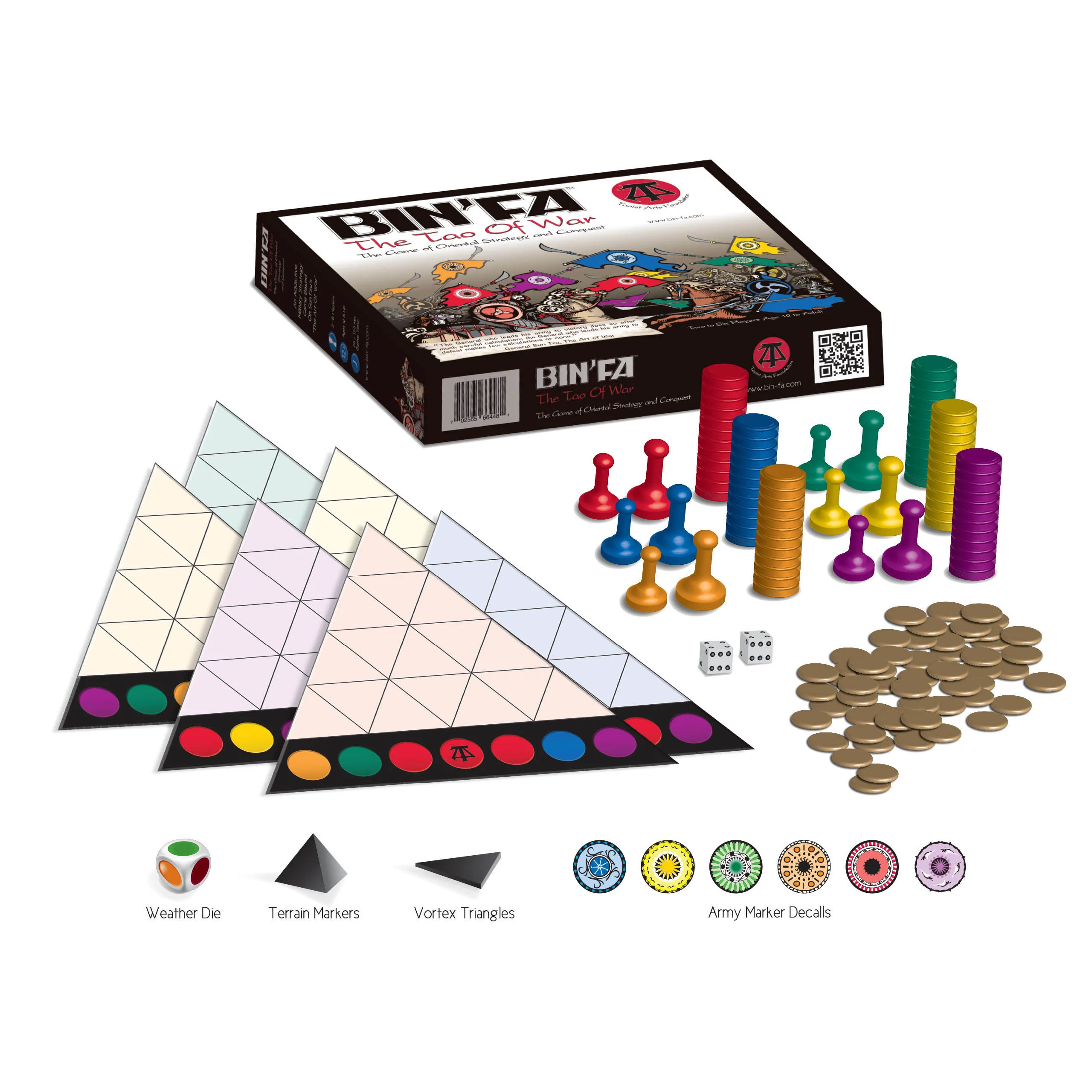
The game board. I designed the six quadrants of the game board, each tied to a player color, so the board could be rearranged into a new battlefield every game while each player's territory stayed instantly readable.
The instruction manual. I laid out and designed the full rulebook, turning a genuinely complex strategy game into something a new player could follow.
The full-game mockup. This is the piece I'm proudest of. Allsaid & Dunn was ready to launch Bin'Fa on Kickstarter, but the physical game pieces were still on order. Instead of waiting, I built vector 3D renditions of every component (the army units, chips, coins, and dice), then arranged them with the board in perspective so the final image reads as a photograph of the complete game laid out on a table. The image was created for the Kickstarter launch in October 2014, so backers could see the finished game before a single piece had arrived.
Marketing. A one-sheet sales flyer for Bin'Fa, built from the same artwork system.
Outcome
The Reading Game went from a sticker on a borrowed box to a retail product, sold today through Target and Amazon and carrying educator endorsements from the classroom world it was built for. The Magic Stories extended the program into second through fourth grade as a downloadable series. Bin'Fa: The Tao of War, an idea Ken had carried for more than forty years, reached market and is available on Amazon.
The trade show display I designed became a fixture, used by Erika at show after show. And when development of Bin'Fa later passed to a new team, the artwork files I built went with it: a design system complete and durable enough to be handed off and carried forward by someone else.
Takeaway
Most of my case studies start with a camera. This one starts with a printer's template. For seven years, Allsaid & Dunn trusted me with every piece of how their products looked and sold, from the first card deck to the box on the shelf to the photograph that sold it. The discipline is the same one I bring to every brand: understand what the product needs to say and who it's saying it to, then make every piece say it.
Horizontal image - Large
Vertical image = 300x400
